This is the most critical “math” step in professional typesetting. Getting your line-height (also known as leading in Adobe InDesign) correctly ensures that your document doesn’t feel “choked” or “gappy.” Line-height should be between 120-180% of the font size.
Tip: For your Titles (80pt+), the 120% rule often feels too “gappy.” Big titles usually look better with tighter leading, sometimes even 100% to 110%.
| Font Size | Min Leading (120%) | Max Leading (180%) | “Sweet Spot” (~140%) |
| 10pt | |||
| 11pt | |||
| 12pt | |||
Body Text
Body text should be subtle
- Select font
- Source Sans
- Acumin
- Fort
- Source Serif
- Proforma
- Abril Text
- Or select one of your own
- Select font size
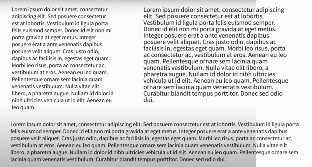
- Select the width or line length (8-10 words)
- Select your line spacing
- Repeat this 3 times to compare (see example below)
Display Text
Arrange Text in a Layout*
Using Fonts to Evoke Feelings*