Brand Presentation
Cover
- Start with a strong cover slide featuring the main logo.
Business Profile
- Explain who the client is, what they do, and the main problem you are solving for them.
- Keep everyone aligned on the project’s core purpose.
- Why it matters: It gets everyone on the same page and gives your design a clear purpose.
Target Audience
- Age: What age group is the primary audience? (e.g., teenagers, middle-aged adults)
- Gender: Does the product/service target a specific gender or all genders?
- Income: What is the typical income range of the target audience?
- Education: What is the audience’s education level (e.g., high school, college graduate)?
- Marital Status: Does the product/service cater to single individuals, families, or both?
- Location: Is the audience located in urban, suburban, or rural areas?
Competitor Analysis
Research existing businesses in your space using this simple checklist:
- Find 2–3 main competitors doing something similar.
- Look at their branding (logos, colors, style).
- Identify their strengths (what they do really well).
- Spot their gaps (what they are missing or doing poorly).
- Define your difference (write down how your brand will stand out).
Mood Board
Gather visual inspiration to set the tone for your brand:
- Color Palette: Select primary and secondary colors.
- Texture: Collect imagery showing tactile qualities, materials, or surface styles.
- Typographic Direction: Find examples of font styles that match your brand’s personality (e.g., modern, playful, rugged, minimalist).
Design Statement
Narrow your research into a clear creative direction before proceeding.
- Design Statement: Write a short paragraph summarizing who your brand is, what it looks like, and the feeling it evokes for the customer.
- 3–5 Core Keywords: Select a few powerful adjectives that will guide your visual choices (e.g., modern, energetic, rustic, minimalist, playful).
Brand Nouns
- Brainstorm 20 concrete, visual nouns related to the business that can be drawn or pictured directly—avoiding abstract concepts or feelings—to inspire your logo mark.

Simpson, Tylia. Website Portfolio Image. Tylia Simpson Graphic & Web Design, https://tylia-simpson.graphicandwebdesign.ca/
Ideation & Sketching
- Ideation: Brainstorm multiple directions before jumping onto the computer. Use your brand nouns to help generate ideas.
- Sketching: Produce a minimum of 20 rapid thumbnail sketches (at least 3–4 distinct conceptual directions explored).
Logo Concepts
- Select your 3 strongest, most original concepts and refine it down into a clean vectors. Clearly label and number each concept and write a brief rationale for each concept.
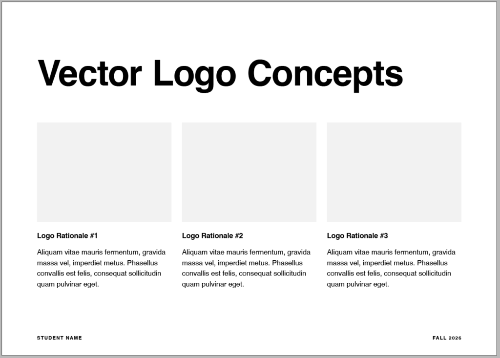
Finalized Logo Concept
- The class votes and selects your strongest along with providing feedback for changes. Please make the adjustments as needed. Please note any provided feedback and note any adjustments made.
Logo Variations
- Primary Logo: The main, full version of your logo with both the icon and business name.
- Secondary Logo: A rearranged version (like stacking a horizontal logo) to fit tight spaces.
- Submark: A simple, compact stamp or badge version used for social media profile pictures.
- Wordmark: Just the business name written out in your custom font, without the icon.
- Logomark / Icon: Just the graphic symbol by itself, used when space is very limited.
- Black and White Version: A single-color version used for printing or stamping.
- Reverse Version: A white version used to stand out against dark backgrounds.
Supporting Assets
- A section for patterns, custom icons, photographic styles, or textures that support the brand system.
Color Palette
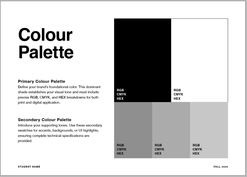
- Primary Colour Palette: Define your brand’s foundational color. This dominant shade establishes your visual tone and must include precise RGB, CMYK, and HEX breakdowns for both print and digital application.
- Secondary Colour Palette: Introduce your supporting tones. Use these secondary swatches for accents, backgrounds, or UI highlights, ensuring complete technical specifications are provided.
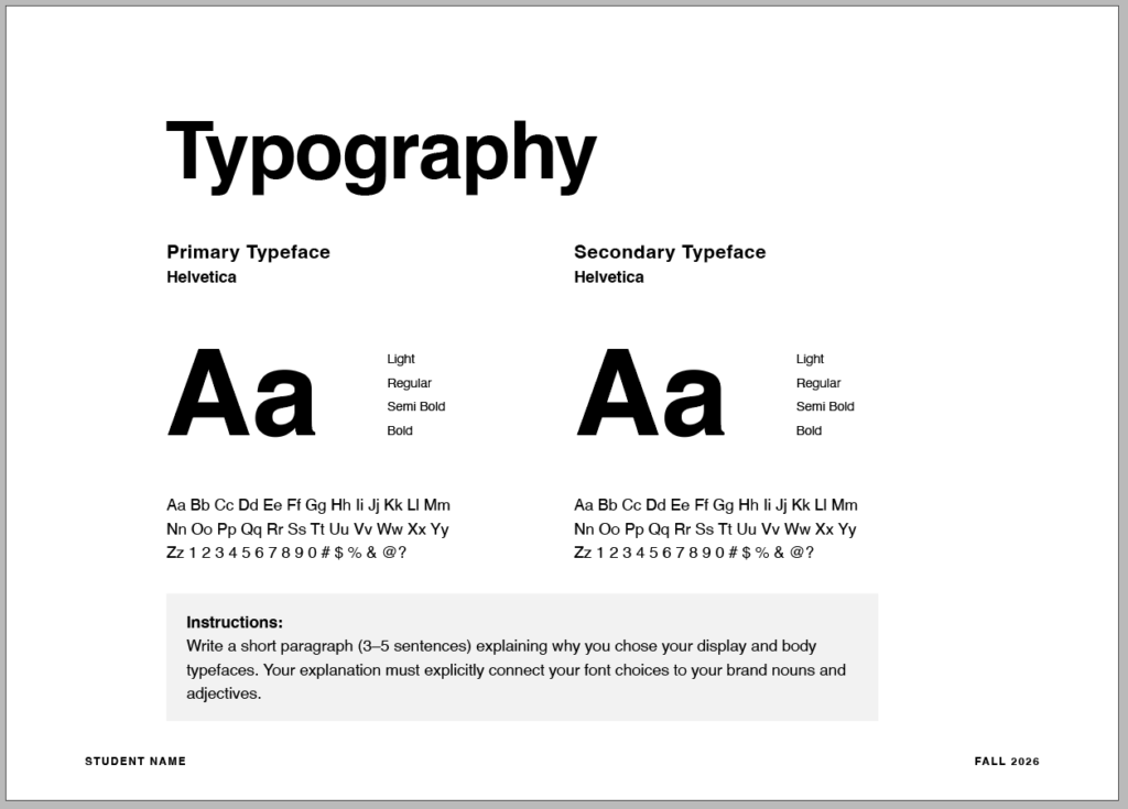
Typography
- Write a short paragraph (3–5 sentences) explaining why you chose your display and body typefaces. Your explanation must explicitly connect your font choices to your brand nouns and adjectives.
Mockups
- Stationery Mockups: Business cards, letterheads, and envelopes.
- Packaging Mockups: Boxes, bags, bottles, pouches, and product labels.
- Apparel Mockups: T-shirts, hoodies, hats, and tote bags.
- Digital Mockups: Laptops, tablets, smartphones, and website screens.
- Signage & Environmental Mockups: Storefront signs, wall murals, windows, and billboards.
- Print & Marketing Mockups: Brochures, flyers, menus, posters, and books.
- Promotional Items / Merchandise: Mugs, pins, stickers, and keychains.
What to Submit
- Packaged InDesign Files: A fully packaged folder containing the
.indddocument, all linked images/graphics, and used fonts to ensure the project opens correctly without missing asset links. - Exported Print-Ready PDF: A properly exported PDF version of the calendar layout, maintaining proper page dimensions, margins, and the required 0.125″ bleed.